
AbdulRehmanPortfolio
Abdul Rehman is a Flutter developer who builds cross-platform apps for iOS and Android. He asked me for a portfolio with its own identity: one that looks nothing like mine and feels like it belongs to someone who builds mobile apps.
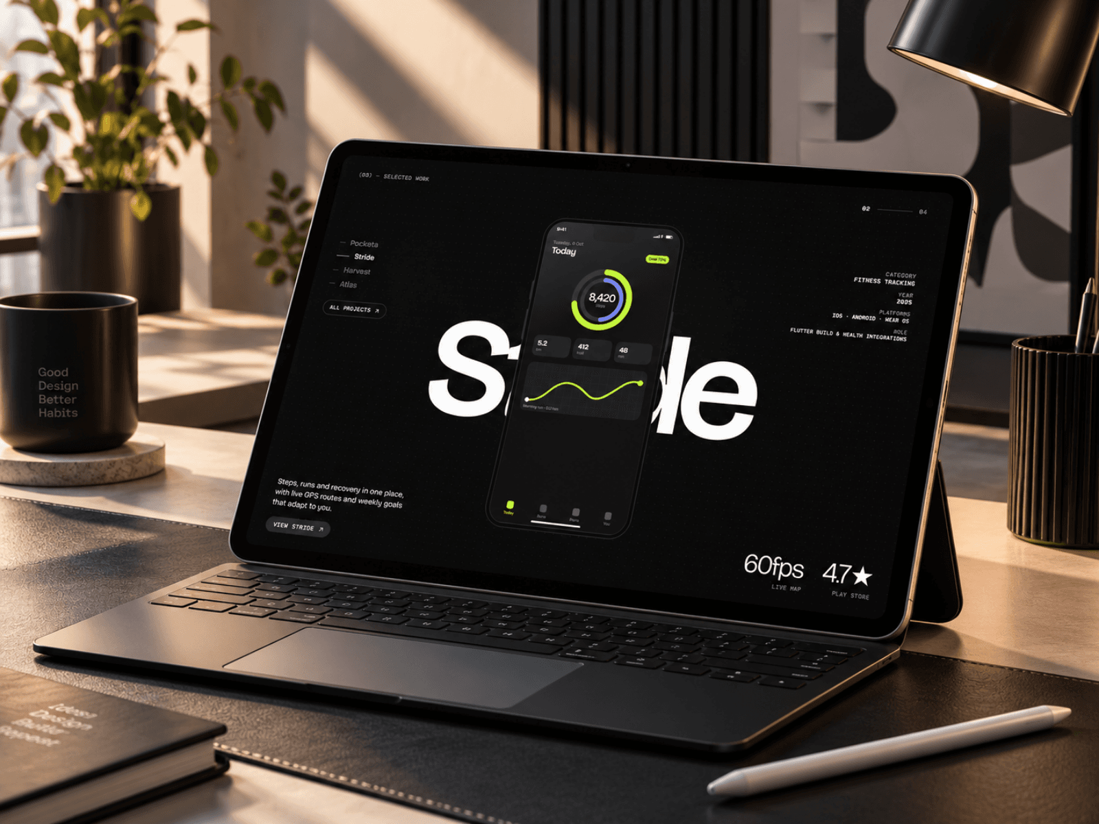
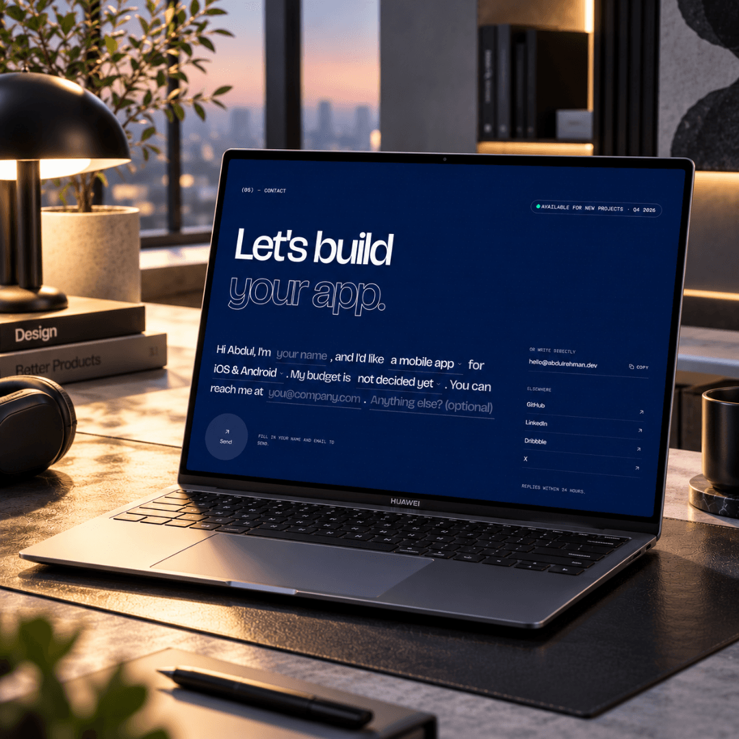
I designed and built the whole site in Next.js. One idea holds it together: a mobile developer's site should be made of mobile interface. The About headline loads like a skeleton screen, with shimmering bars that resolve into words as you scroll. The work section pins a single phone in the centre while its screen scrolls from one app into the next, and each project's name stands huge behind it. Client reviews turn on a picker wheel, his skills sit in folders on an iOS-style home screen, and the contact form is one sentence you fill in.
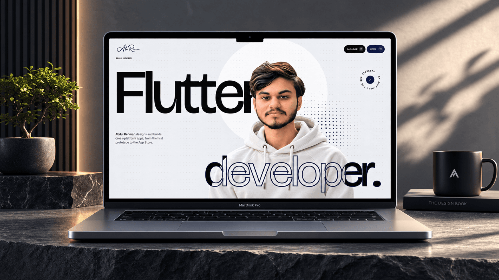
The hero sets the tone. The word "Flutter" sits behind his portrait and "developer." crosses in front of it, solid where it is clear of him and outlined where it overlaps, so he stays visible through the letters. Behind that, a canvas of navy dots swells around the cursor, and the letters grow heavier as the pointer comes near. The whole site uses three colours: white, black and navy.
The app screens inside the phone are drawn in code rather than pasted in as images, and everything personal lives in one config file and a handful of data files. The apps and reviews in these screenshots are sample content, which Abdul replaces with his own without touching a component.
The Challenge
A developer portfolio usually ends up as a wall of logos and a grid of screenshots, and it could belong to anyone. Abdul wanted a site that is clearly his: nothing borrowed from my own, and a design that says "mobile" before you read a word.
The Solution
One idea, carried through every section: build the site out of the things a mobile developer makes. A skeleton loader becomes the headline, a phone becomes the gallery, a picker wheel becomes the testimonials, a home screen becomes the skills list and a chat becomes the contact page. Sections hand over like a stack of cards, each one pinning and dimming while the next slides up over it. Three colours and a strict type system keep it reading as one piece.
The Tech Stack
Next.js prerenders every page as static HTML. GSAP with ScrollTrigger drives the scroll-linked work, the pinned phone and the card hand-offs, while Motion handles component entrances. The hero's dot grid is drawn on a canvas, and Bricolage Grotesque is a variable font, so the cursor can change a letter's weight and width without loading another file. Tailwind CSS v4 holds the colour tokens, and the app screens are sized in em units from a container query, so they scale with the phone.
The Impact
Delivered as a complete site: a five-section home page, a filterable projects index, a page for each app, an about page and a chat-style contact page. It respects reduced-motion settings, and scored 96 to 100 for accessibility and 100 for SEO in Lighthouse. Abdul's own apps and reviews drop into the data files, with no design work left to do.
01 / Typography
Bricolage Grotesque
A variable grotesque whose weight and width react to the cursor, paired with Martian Mono for small labels and an italic Instrument Serif for the odd accent word.
02 / Palette
Navy
#0B1A4A
Ink
#0A0A0B
Mist
#F3F4F7
White
#FFFFFF

Sun Quest Solar